These are all the entries for the competition.
The competition is now over, it ended on November 15 2010.
Vote from the homepage…
SkaterBoy Iltis
Shoji
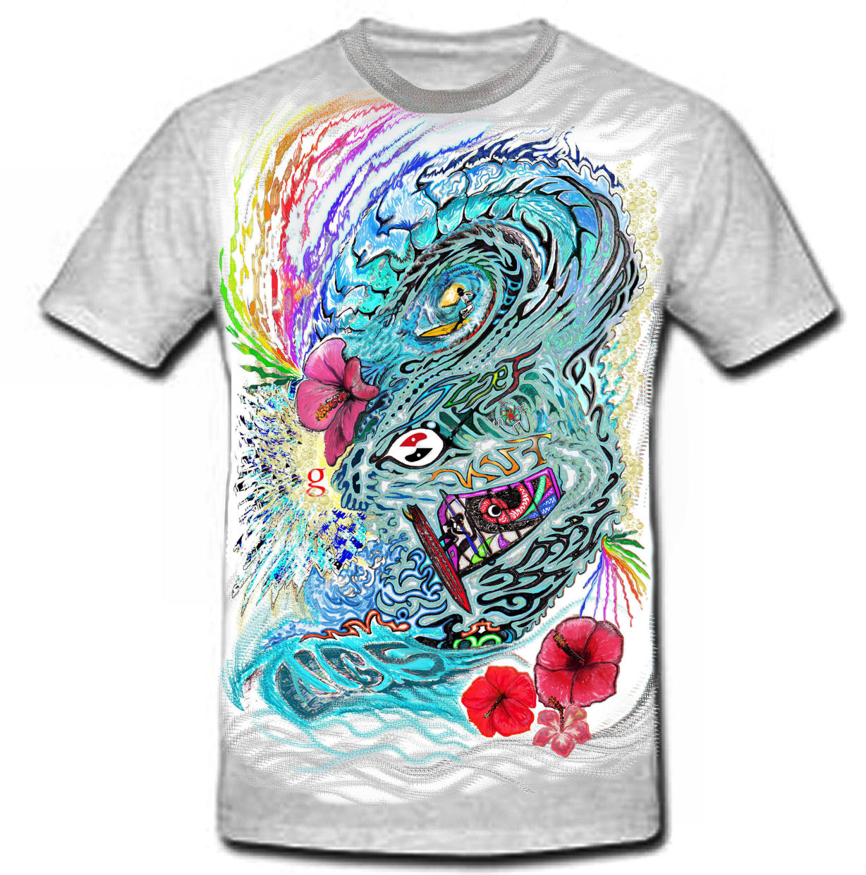
Gaysurfindo
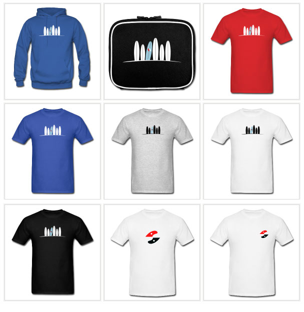
This design is now available in the store:
Stryker
Dawn
12 thoughts on “New entries for the t-shirt design comp”
I like Justin Boydes T shirt with the red malibu leaning to the right! that with Don Alberts design on the arm or maybe even a tattoo. keep up the good work guys!
you seem to be winning the t-shirt design competition J… Can you email me a vector version for printing with the logo I sent you by email? info@gaysurfers.net
I have to concede that Justin’s makes a fantastic and clever T-Shirt design, but I’m not so sure its a good “logo” as such, because of the scale. The fins kinda get lost IMHO. I vote for Justin’s shirt, but reckon the original GS logo must remain unchanged. (Mine was meant to be two interlocking hearts BTW)… er…ahem…cough…
Thomas said that we can change the colour of the logo for the competition. I didn’t knew we were asked to create a new logo. I thought it’s a t-shirt design contest, not a logo design contest.
Hi Lucas
It was not a logo contest, it was a t-shirt design competition where members are asked to use the existing logo,
You did what was asked, dont worry…
Thomas


I like Justin Boydes T shirt with the red malibu leaning to the right! that with Don Alberts design on the arm or maybe even a tattoo. keep up the good work guys!
Yep I agree Justin Boyd’s really says it all. Good Work!
Thanks for the comments guys – i’m stoked you like it 🙂
you seem to be winning the t-shirt design competition J… Can you email me a vector version for printing with the logo I sent you by email? info@gaysurfers.net
Wow I was going to enter, but those entries are all friggin sweet! lol… Nod to all and especially Justin, subtle yet to the point! Aloha!
I have to concede that Justin’s makes a fantastic and clever T-Shirt design, but I’m not so sure its a good “logo” as such, because of the scale. The fins kinda get lost IMHO. I vote for Justin’s shirt, but reckon the original GS logo must remain unchanged. (Mine was meant to be two interlocking hearts BTW)… er…ahem…cough…
I like Shoji’s best for a logo…a hard choice between his and Justin’s. For a logo, simple is best…
i like 4 and 6 best , but i like simple
Thomas said that we can change the colour of the logo for the competition. I didn’t knew we were asked to create a new logo. I thought it’s a t-shirt design contest, not a logo design contest.
Hi Lucas
It was not a logo contest, it was a t-shirt design competition where members are asked to use the existing logo,
You did what was asked, dont worry…
Thomas
OK, no one else is saying it, I like the guy who is wearing t-shirt 4, the t-shirt aint bad either, ha ha …
thanks Mark 😉